Lorex Security Recorder Ui
UX/UI Case Study – 2021
The Project
With the company’s new vision on improving the user experience and usability of legacy devices, I was charged with assessing and studying the present Network Video Recorder Ui in order to create and propose an improved version for products in 2022. After conducting user research and testing on the present interface, I worked with the research & development team in Beijing to build a new updated interface that highlights user needs and is consistent with the company’s new product lineup.
The Plan
- Analyze the present recorder interface and find areas for improvement where the designs fall short of modern usability standards.
- Create and distribute a survey to existing recorder customers to obtain feedback on their interactions with the interface. Compare the gathered input with the indicated pain points.
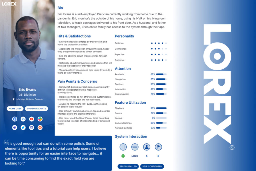
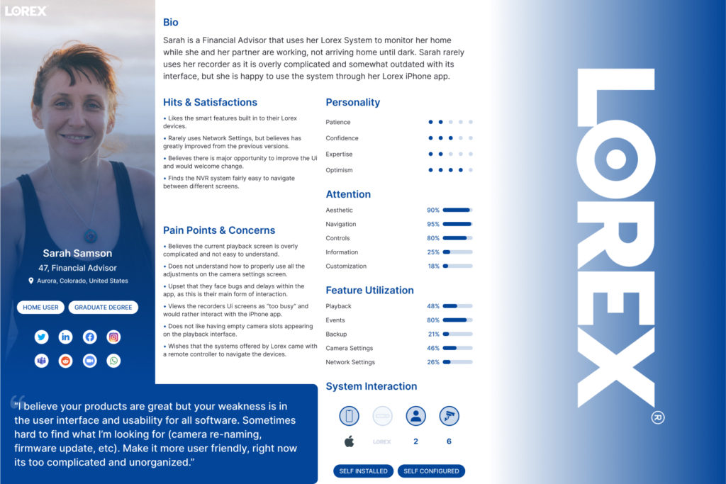
- Create three personas to represent the key user groups of Network Video Recorders. Determine the personas’ needs, desires, and pain points in relation to the existing Ui.
- Build Wireframes that meet user needs, and propose new User Interface for 2022 Network Video Recorders.
- Work with Research and Development team to further develop Ui. Test interface iterations to resolve bugs and improve product user experience.
My Role
As a result of this project, I was appointed product owner of recorder interfaces, with responsibilities that included performing extensive research, developing wireframes, and getting the product to market. I collaborated with the Product Team to build and distribute a survey to current users throughout the research phase. At this point, I was responsible with creating and presenting personas to the senior management team in order to explain the primary user needs for our upcoming products. Finally, as a Product Manager, I was tasked with developing and testing the interface in preparation for product launch in collaboration with Research & Development and the Quality Assurance Team.
Research Discoveries
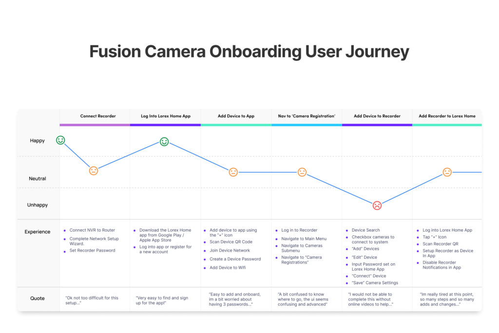
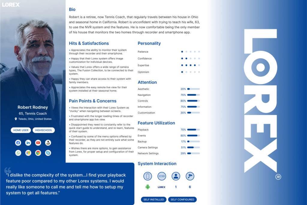
Based on my study with current recorder users, I was able to create three personas that indicated the following user needs and product user experience pain points:
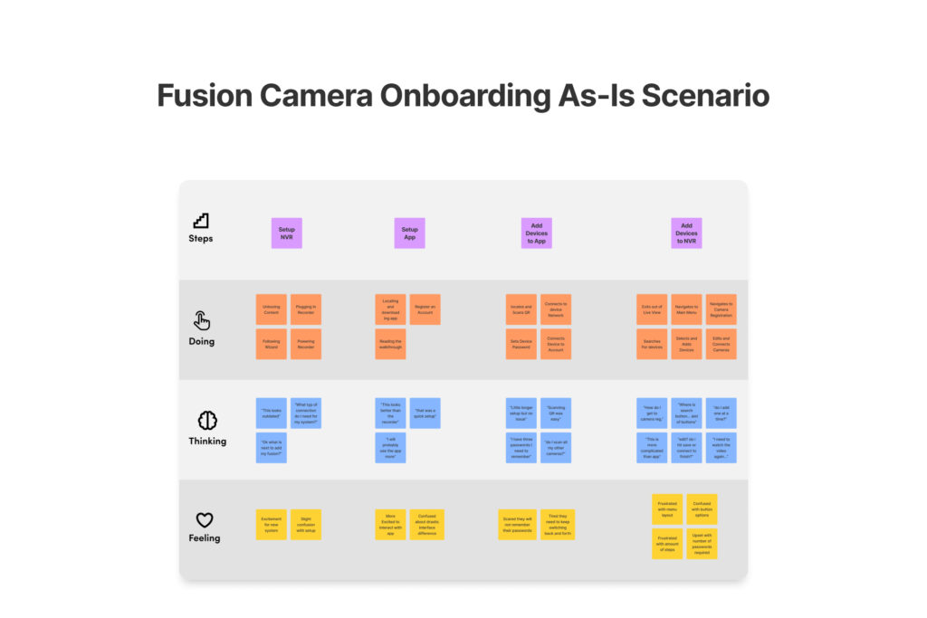
- Persona 1, Eric, appreciates the functionality given by their system and trusts the security provided, but finds it difficult to switch between the App and recorder interfaces due to the significant differences.
- Persona 2, Sarah, believes there is a significant opportunity to enhance the Ui and would welcome modification since she considers the Ui screens to be “too cluttered” and would prefer to interact with the iPhone app.
- Persona 3, Robert, appreciates the ability to monitor their system via their recorder and smartphone, but wishes there were more opportunities for gaining assistance from the company for proper system setup and configuration.
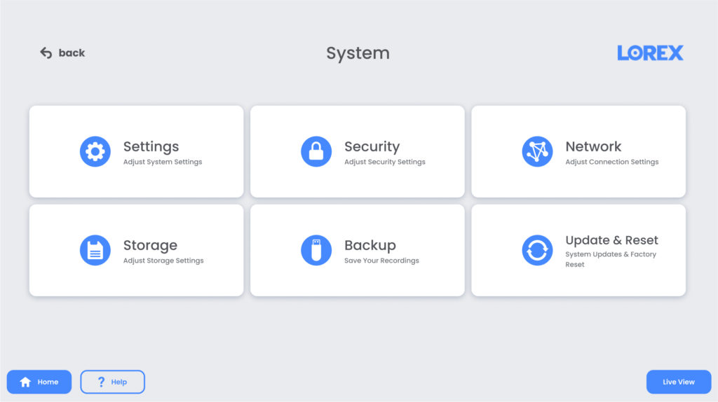
During the study process, I also noticed that both consumers and staff members thought the menu naming practises were overly complicated. This would necessitate a re-evaluation of the Information Architecture and feature names in order to provide a more comprehensible system interface.
Wireframe Prototypes
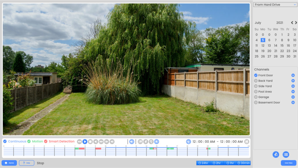
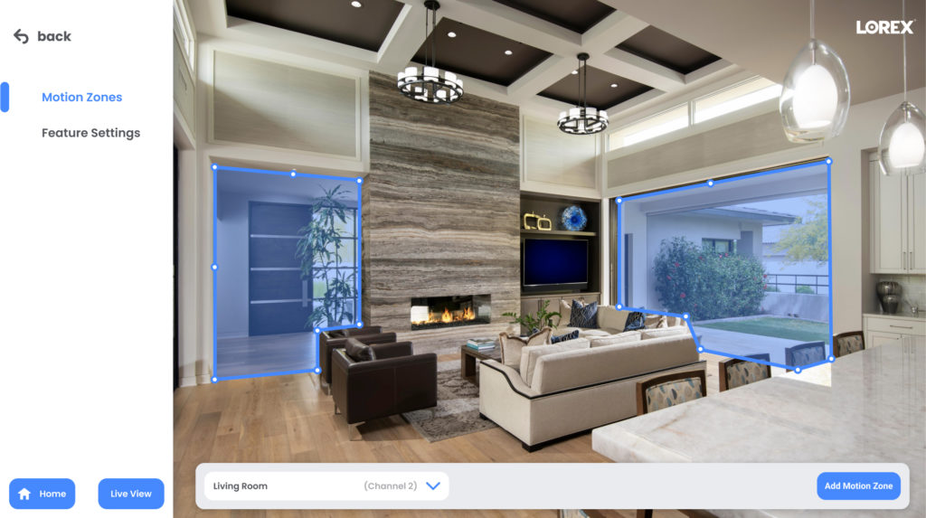
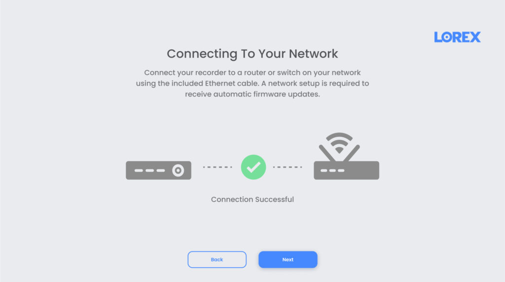
To fulfill project deadlines, I moved right into mid-fidelity wire frames, creating early prototypes to improve on the present design. I began creating concept designs for the development team in order to establish the level of achievable deliverability for the new interface. When creating the revised interface main menu, video playback screen, and a brand new assistance menu for customers, we considered the persona pain points in order to produce an interface that could provide a better user experience.
Final Product
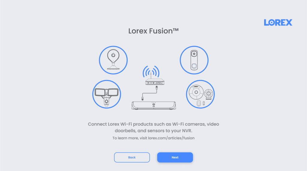
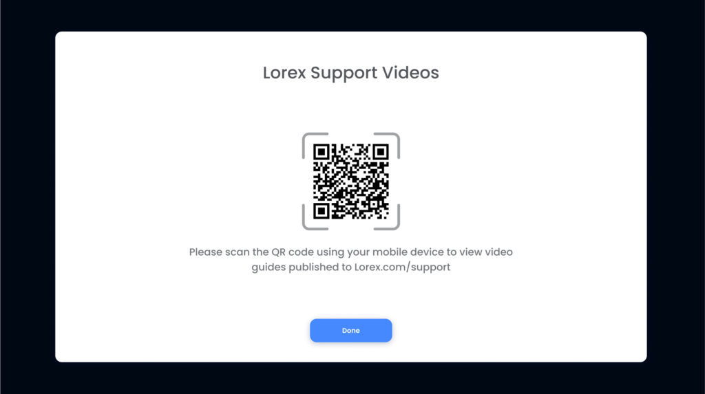
The new network video recorder interface will be released alongside the company’s 2022 products. I was able to get a design that closely reflects the simplified experience of the smartphone application by giving the user interface a fresh appearance. I was able to create a fresh, simplified design that adhered to modern guidelines, while also integrating new features, such as the QR Help Menu, to enhance the experience for future users.
Platforms Used
- Microsoft Teams
- Microsoft Forms
- Figma
- Adobe Xd
- Balsamiq
- Figjam
- Jira
- Confluence
