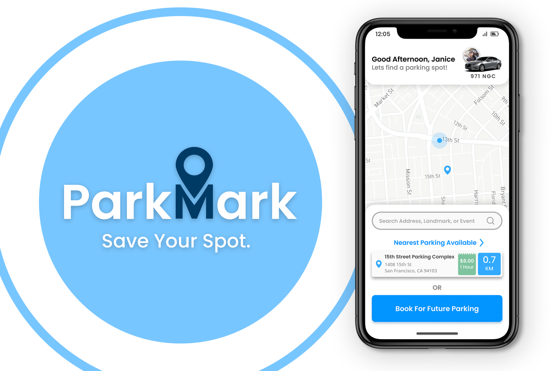
ParkMark: Parking App
UX/UI Case Study – 2020
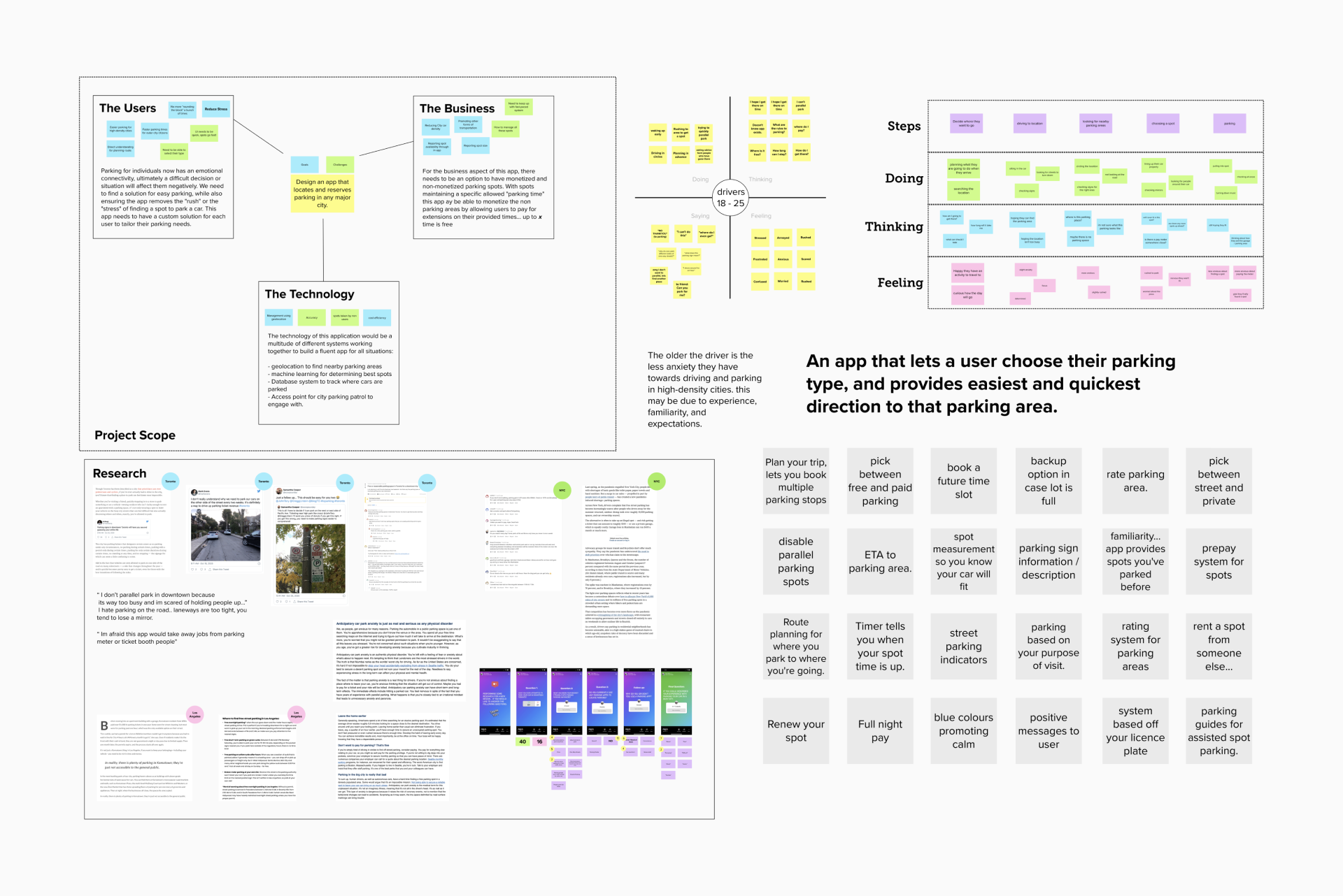
The Project
In March 2020, I participated in a solo UX design challenge to research and build a parking application that would help people locate and reserve space in congested areas. With a 72-hour time restriction, I used a basic agile process to determine the major user needs and wireframe the app “Park Mark” in Figma.
The Plan
- Design a short survey to launch on social media related to the topics of car parking, driving in busy cities, and general parking anxieties.
- Interview users you know that typically drive in busy cities, or frequently park their vehicles in Downtown Toronto.
- Research popular social media posts that use the hashtags: #parking #busycity #carparking #driving.
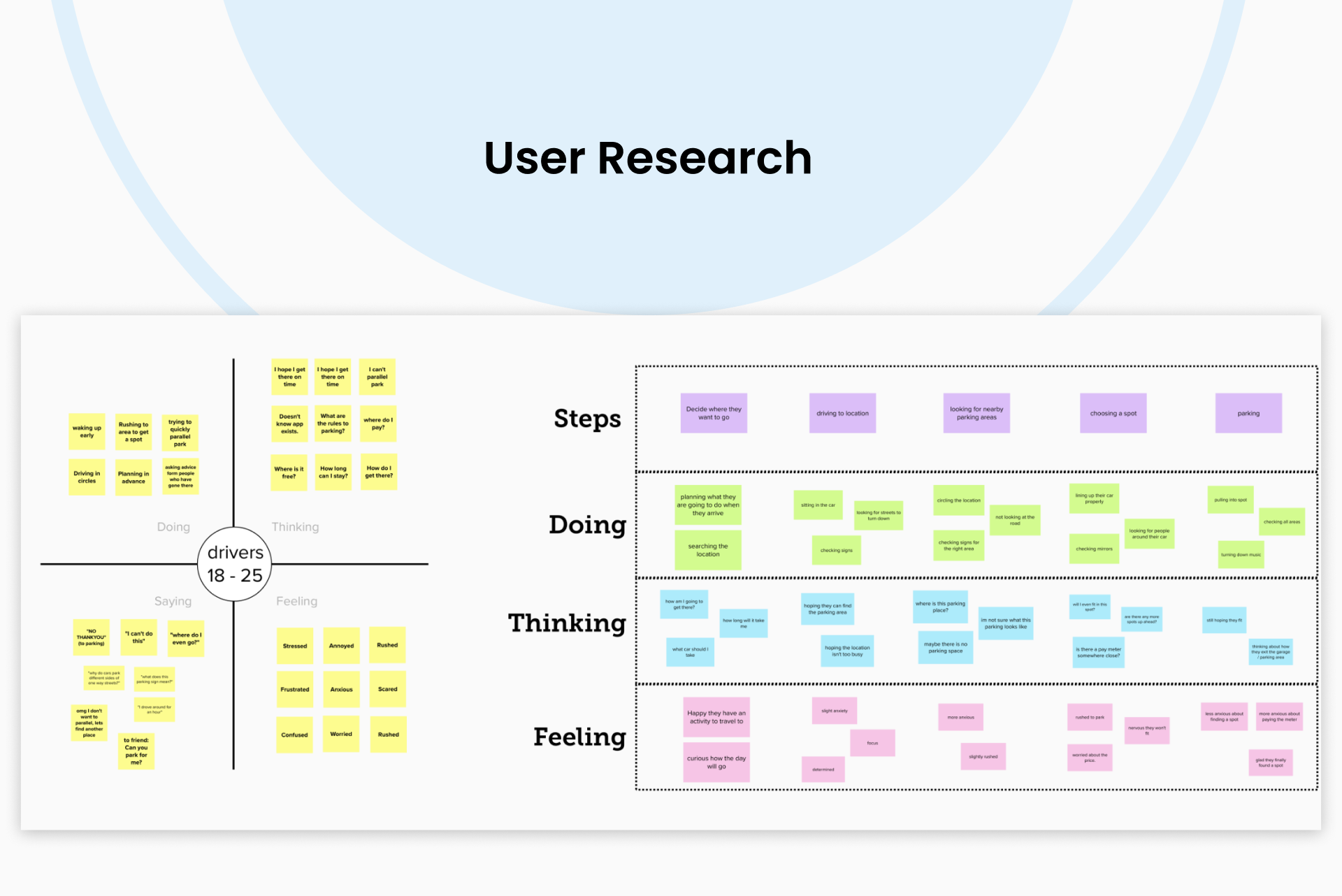
- Outline the user “Doing”, “Thinking”, “Saying”, “Feeling” states to understand the baseline user needs for an application.
- Conceptualize 2-3 features that could meet user needs and reduce pain points.
- Wireframe designs in High Fidelity using Figma to produce an app prototype. Collect user feedback on the wireframes and iterate on final design.
Research Discoveries
Throughout the research process, I validated my hypothesis of a widespread negative attitude about parking in a busy city. However, I was able to identify one of the primary user pain points as an uncertainty around if parking spaces will have enough space to accommodate their larger car. It was also discovered that consumers would prefer to know ahead of time which parking spaces will be accessible in the lot. Finally, I noticed that the vast majority of users would choose to try to find a new parking lot rather than attempt a parallel park method.
App Features
To address the user needs identified during the research phase, I conceptualized and built three primary features that would alleviate the pain points associated with parking in a big city:
- The parking application homepage will always display the nearest available parking lot or spot. This reduces the amount of time a user must engage with the app in order to identify nearby parking places.
- Users will be able to disable “Parallel Parking” spots, which will cause the app to exclude all available options that need this parking style. Users will be glad to know that the location they selected will be one they are comfortable with.
- The app will inform users of the type of parking spot available (indoor, outdoor, or street) as well as if larger cars will fit in the available locations.
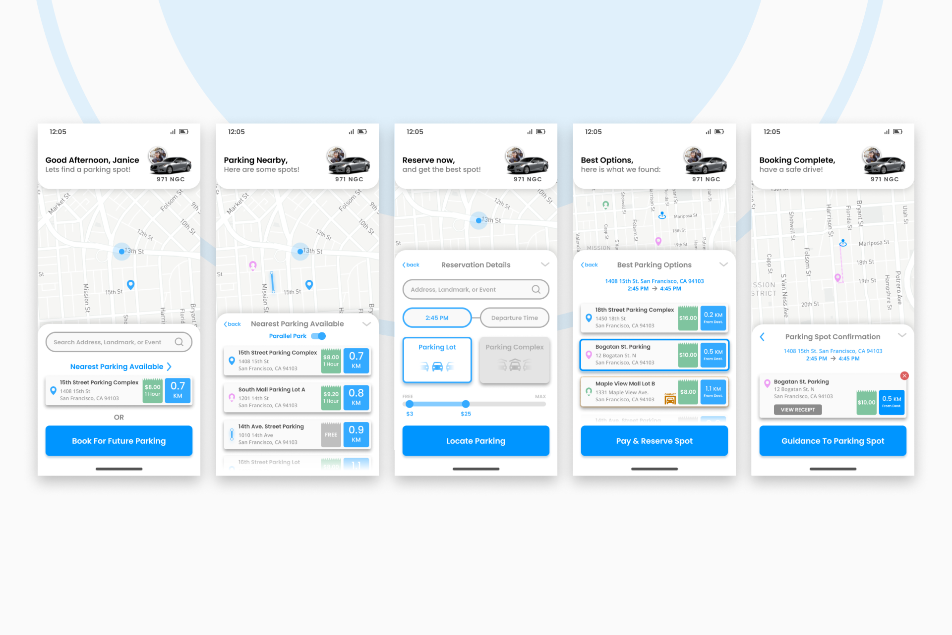
Wireframe Prototypes
I was able to wireframe 5 pages for the new application using the research I collected, showcasing how users can instantly search for parking in the region with a single click. Users will be able to search for parking spots using various filters such as location, space, parking size, parking type, and hourly fee. Finally, users will be able to quickly reserve their space or schedule future parking, with the app following up with a confirmation page and payment screen. I opted to employ colour to suit user needs as well, primarily because blue and green are typically linked with relaxation and calmness. Overall, this app concept fits the user demands uncovered throughout the research stage and allows me to demonstrate my design skills through the usage of the Figma platform.
Platforms Used
- Microsoft Forms
- Figma
- Figjam
- Zoom