Toronto Community Housing
IA/UX Case Study – 2021
The Project
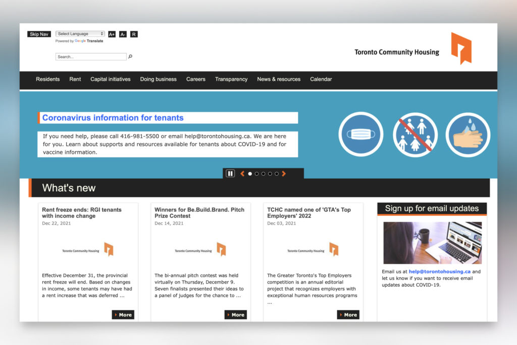
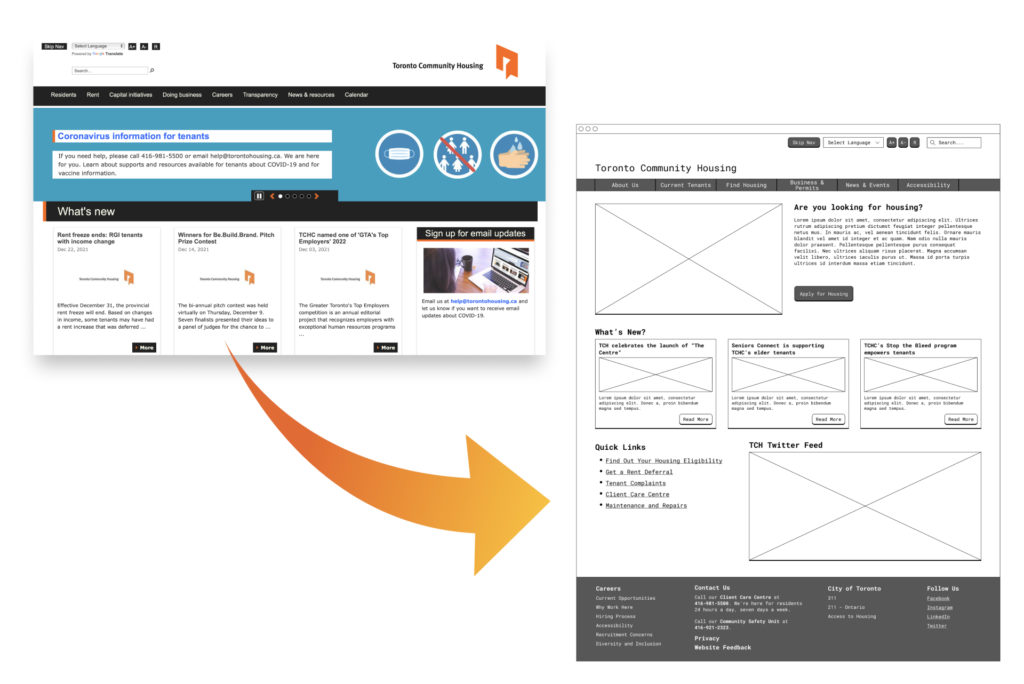
Our team set out to analyze the Information Architecture of the torontohousing.ca website, in order to discover potential user barriers based on the structure and information placement of the site. Using a variety of research approaches, such as card sorting and tree testing, our team proposes a new website schematic to enhance the overall site IA.
The Plan
- Analyze the current architecture of the website and identify areas that could be difficult for users to navigate to or understand using website crawling.
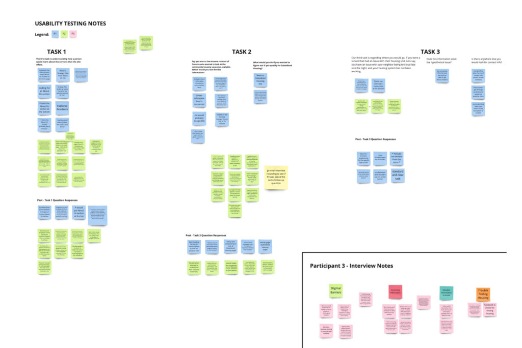
- Perform user interviews and usability testing on the current site to gather user feedback and confirm analysis pain point areas.
- Conduct a Card Sort research to learn about natural user patterns for organizing and comprehending information on torontohousing.ca.
- Propose a new IA Schematic to the website that meets user expectations and removes current barriers.
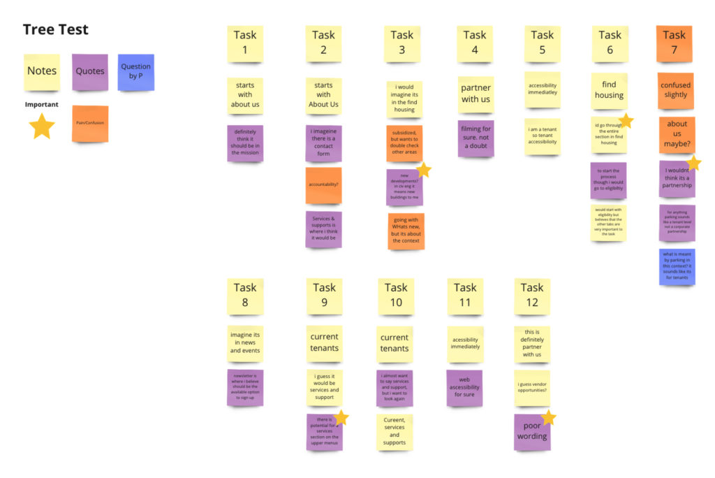
- Analyze new IA Schematic by conducting a Tree Test Study to confirm new improvements meet the user needs
- Iterate on proposed schematic and present final concept prototype for new Toronto Community Housing Website.
My Role
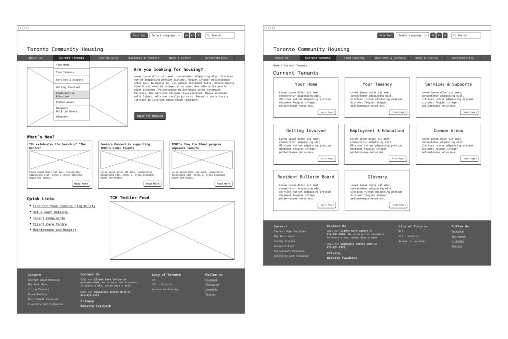
Throughout the research phase, I served as a note taker and moderator for the user interviews and card sorting study. I collaborated with team members to create a new IA schematic that addresses the user needs identified throughout the study. After our team developed the new website schematic, I also conducted a tree test study, and at this point, I was in charge of creating and producing the final IA diagram and proposed website wireframes.
Research Discoveries
Our user research and usability testing assisted our team in identifying the key issues with the present Toronto Community Housing website and information organization. First, our team discovered that user groups were failing to comprehend the organization’s purpose, which caused uncertainty about where to get information about the team and business goals.
Our team also identified a problem when users attempted to access various information sections relating to present tenants in the TCH building, as well as information for prospective renters to the organization. We observed that Toronto Community Housing’s corporate clients had their own portion of the website, but the naming standards and navigation layout generated ambiguity about what partnership options were available.
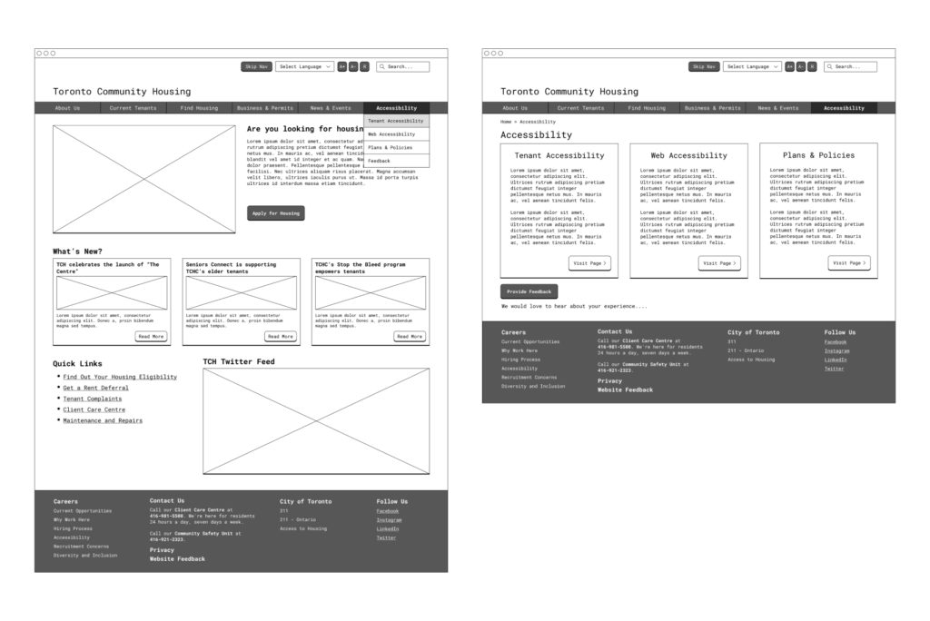
Finally, we noticed that the accessibility tools and information on the website were not clearly displayed for users, and we learned that many TCH tenants have accessibility needs and require some kind of adjustment to the website and the services provided.
Information Architecture Improvements
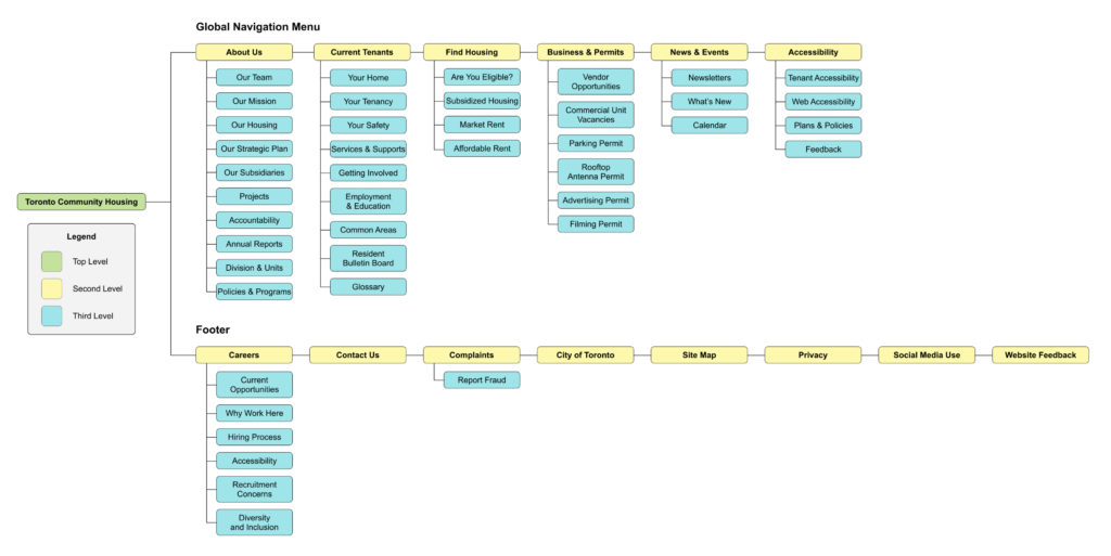
- Improved the website structure, by developing three distinct IA levels and a new global navigation system.
- Relocated the “About Us” section to the global navigation to address users’ frustration with not understanding TCH’s role in the Toronto community.
- Created two new pages, “Current Tenants” and “Find Housing,” to house information for current TCH Residents and future prospective tenants.
- Added an “Employment & Education” Page for users to quickly access information related to job and education opportunities by TCH.
- Created a “Are You Eligible?” quiz to help users quickly determine which housing options are available to them.
- Retitled the “Doing Business” section “Business & Permits,” as well as all submenu choices, to assist the third group of target users, which comprises businesses and people looking to partner with TCH or get various permits TCH offers.
- Added a “News & Events” section to the website that houses information and resources for all user groups. This included the Calendar, Newsletters, and “What’s New” sections.
- Relocated all information & resources related to user and tenant accessibility into a single, highly visible, “Accessibility” tab in the global navigation. Intended to host all accessibility-related pages to highlight the different types of accommodations that TCH offers.
Final Takeaways
Our team set out to identify potential changes to the Toronto Community Website and the structure of information architecture that could improve the user experience. Our team was able to effectively redesign the entire site to fit the needs of all user groups while also improving on the present User Experience by conducting extensive research using Card Sorting, Tree Testing, and Usability Studies. We offered a new information architecture using schematic diagrams to demonstrate how the site’s existing structure may be improved in the future. Finally, our team created a functioning prototype for the new website that displays the team’s accomplishments.
Platforms Used
- Miro
- Microsoft Forms
- Optimal Workshop
- Figma
- Zoom
